Apr 8, 2023

What you will read in this article:
Retrospective
The community
The decision phase
The change
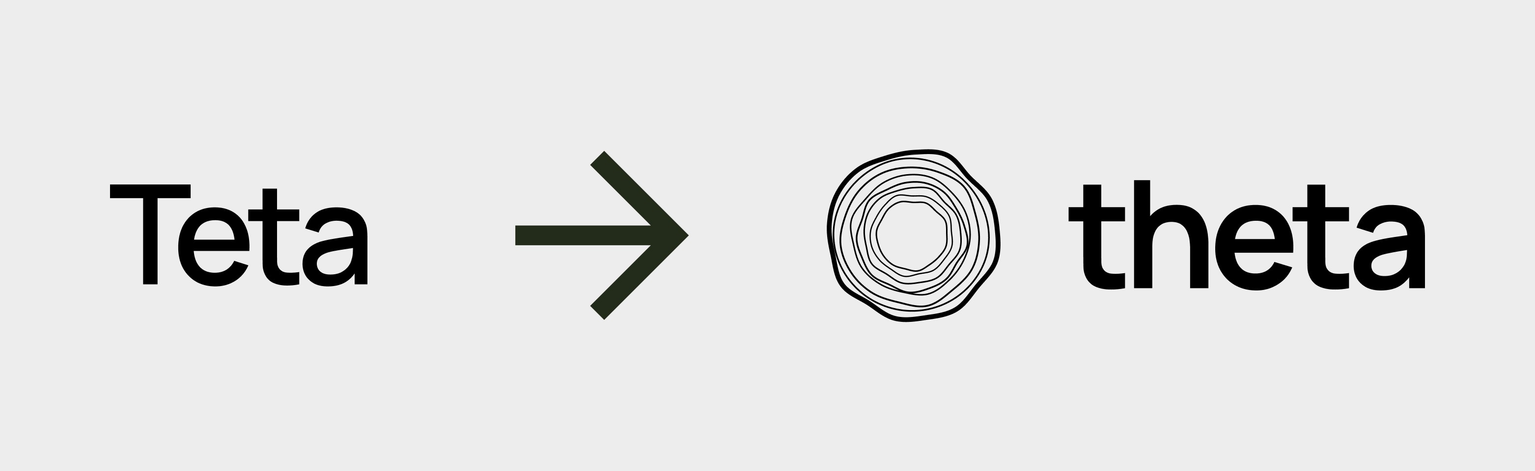
Some of the most frequently asked questions we have been asked during this period are: "why did you do redesign? " and "why this logo?", but especially "why the change from Theta to Theta (with an h)? ".
To answer this it is necessary to take a step back and tell for a moment what the initial product was. With our startup, we launched our first product on the market in 2021: A No code Flutter based app builder whose Vision was to make app creation accessible to everyone.
After several months of analysis, we decided to do Pivot. Read the article dedicated to Pivot
Let's change everything. Let's change the product. Let's take the leap to also make the name change (which we were already talking about several months ago).
The community and the naming.
What was the reason for the name change?
We admit, we made a design mistake. We thought and decided on the name (Teta) without thinking about the meaning of the word in different languages.
Teta in a year and a half became known all over the world (+160 countries) developing a very diverse community, a global community, and then we got to the point where we were also known in Spain, Portugal, Brazil, then Latin America, the United States and all those areas where they speak Spanish.
The name "Teta" actually created a problem for us from the beginning. One of the classic ironic comments under our posts was "Do you know what Teta means in Spanish?" We at first rode the wave joking and being ironic about our old name which means exactly boob in Spanish, however, then over time we realized that with investors there could be a problem. Effectively the name could make it seem, in the eyes of investors, like the usual company that was not serious or at least took lightly comments that came from all corners of the world.
April 2023, The right time had come to change everything.
April 2023, a new beginning - THE CHANGE
We met together and after a long talk, we set ourselves a huge goal: To change everything (Name, brand, design and product) in one month.
Did we succeed? Yes, we changed the name, made a new brand and then created a new identity, a new design System based on
versatile components and elements, modular elements, just like when you go to design an interface, with different visual elements, components, that put together in composition create a unique interface.
Through this Concept we developed the whole design.
The birth of the pictogram
Starting from the theta waves, we started to make some graphic drafts, we tried to make them our own, stylize them.After that we tried to have them generated by the artificial intelligence and the artificial intelligence created for us the very first draft of our current pictogram and then a circle with totally random waves that go to simulate in a very conceptual way the theta waves created by our brain and then enclosed in a circle that is like looking at our head from above.
Keywords
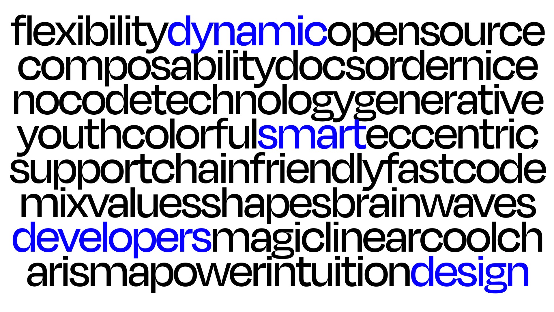
As already partly anticipated, the keywords for this re-design were versatility, composable, so something buildable the modular piece by piece but above all youthfulness, freshness, dynamic, colorful
With the keywords we gave the foundation and then all that was mainly done was a lot of reference research, the creation of different moodboards, to understand also the different sign system and how we could integrate already existing icons that were useful for the UI and to actually understand what kind of fonts to use, how to use them and finally what colors to use and for what reason.
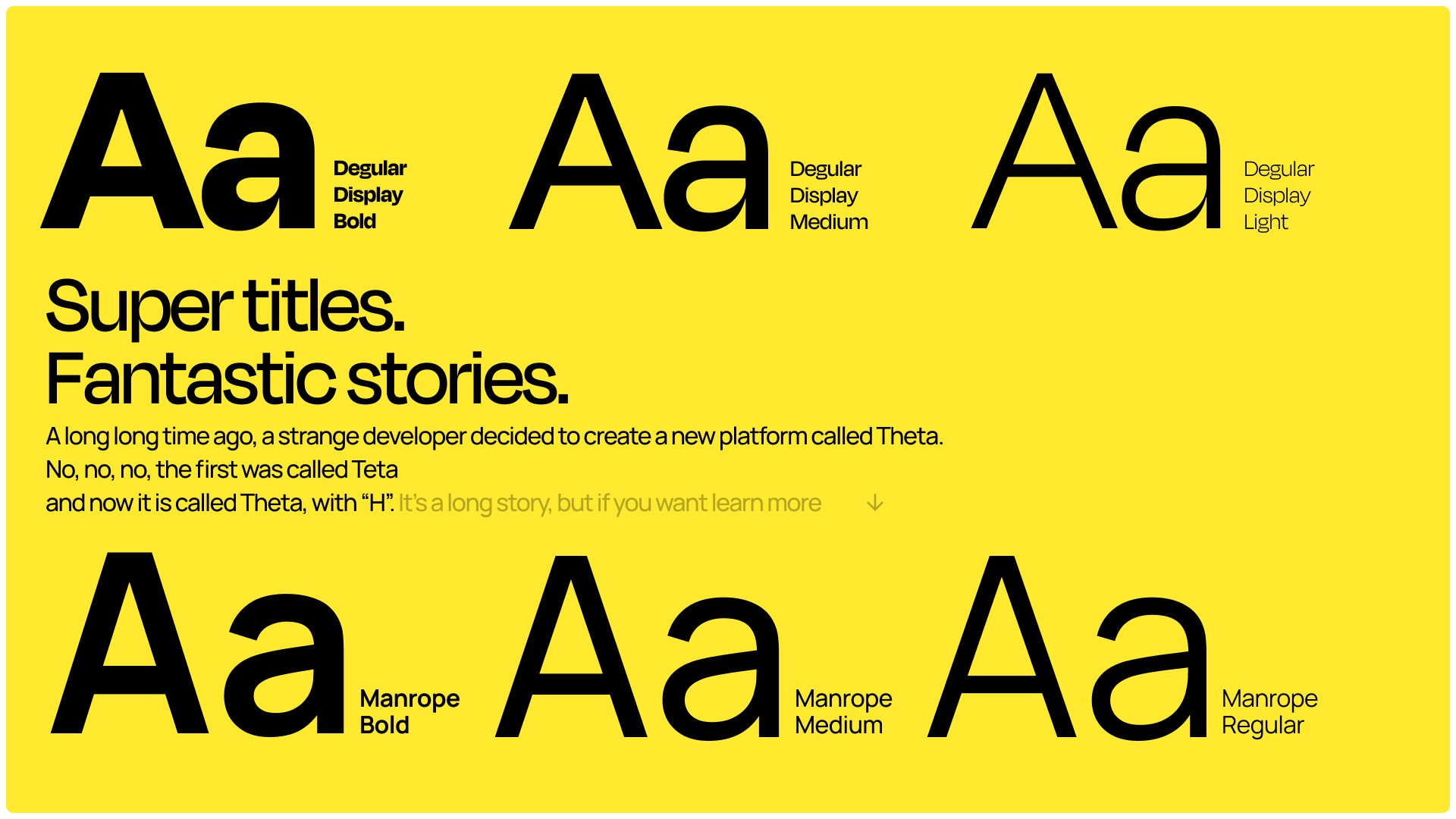
Our fonts: Degular Display and Manrope.
Hence we decided to pick up the old fonts also to give continuity with the old product. And thus somehow create a common thread through very recognizable visual element as precisely a font. But this time we gave a bigger push, the Manrope becomes a secondary font and Degular display officially enters the scene, as a primary font.
A font that takes on a special power in the whole visual identity of Teta.
For what reason? because we mainly go to use this font with much larger body and therefore almost as if it were a mega Type and above all we go to use weights like medium and semibold that go to accentuate those Glyphs those particular shapes, enhancing it.

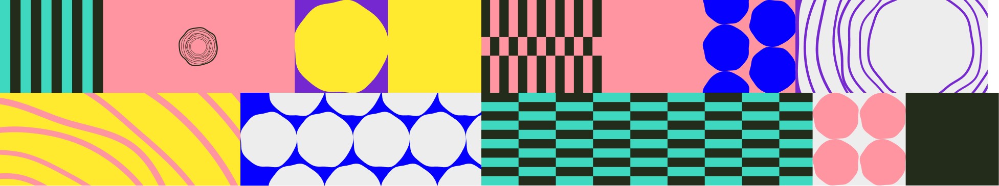
Patterns
The request was clear, the concept strong: twist the product, make it lighter and make it versatile, modular, fluid and dynamic.
We started with simple shapes, the primary geometric shapes, put them together and began to imagine all the various outputs, all the various applications.
Polygons, lines, dots, breaks, brain waves, generative waves, and then pastel colors, strong colors, saturated colors.
The patterns then conceptually represent all the magic behind Theta.
Components, blocks, lines, packets, code.
Well, this was just an intro, talk to you soon with the second part, where we will talk about our design method, all the background and some curiosities of the project made in one month
Take care
Gianluca
Share this article
